Monday, June 24, 2013

CLASSES STARTING IN JULY!


COMPOSITION AND COLOR - TAKE YOUR PAINTING TO THE NEXT LEVEL!
CLASSES STARTING IN July 2013

Hello art friends!

I will be starting classes in July 9, 2013. I will be teaching beginning, intermediate and advanced watercolor and an intermediate and advanced oil painting class. The classes will be held on Tuesdays, Wednesdays and Thursdays, morning 10-12 am and evening 7-9 pm. If you are interested, please call me for information and supply lists (801) 389-2369.

Class size will be held to eight students in each class and cost $60.00 per month. Students will work in class on watercolor painting, demo and lecture on Tuesdays and Wednesdays. Due to ventilation and health issues of oil painting, the advanced classes on Thursday will be limited to demo, lecture, art history, critique, business issues and homework. You will have a great time creating beautiful art and pushing yourself beyond your comfort zone and on to the next level of progression!

For my full bio, resume and qualifications, please go to my website shannakunz.com or request via email. I can forward articles about my work from Southwest Art Magazine, American Artist, Western Art Collector and Fine Art Connoisseur as well as shows and awards. Referrals and recommendations upon request.
Hope to hear from you soon!

Shanna
shankunz@earthlink.net

Tuesday, June 11, 2013

Rocky Mountain Frames - June Sale


Rocky Mountain Frames sale prices on the Bard for plein air! 8x10 = $66, 9x12 = $75, 11x14 +$83, 12x16 $106. Order online or call him at 801-628-4245. Four different finishes, same price. Great deal for a finished corner frame!


801-628-4245, Tony Schleich

www.rockymountainframes.com

Wednesday, May 22, 2013

Demo for the Midway Art Association

I was invited to do a demo/lecture last night at the Midway Art Association's monthly gathering.  I had such a great time, such great people!  I am always quite nervous in the beginning and ramble much, but it usually doesn't take much time for my non-sense makes sense.  In the spirit of "ridding oneself of the tyranny of things as they appear",  I explained my series process of working in value and contrast keys.  We all picked a demo of a high-key, low contrast piece with color temperature shifts as the contrast and development of spacial relationships.  Here is the before and after pics, although I am sure it's not quite finished.  I would like to do a little glazing and defining after it dries and that might take a few days.  As promised, here it is posted on the blog.  Please feel free to add suggestions or make comments.


Tuesday, March 26, 2013

Starting an advertising identity.....branding

My good friend and artist George Handrahan came over today with all of his design and program knowledge and helped me get an ad together.  I am thinking about doing a campaign with some specialty magazines to get my work out there a little more.  It was a very interesting process!  He used InDesign to get the design started and switched back and forth a little with photoshop.  The first task was the most difficult - finding a font that was a reflection of not only my work, but directly identifying a genre as well.  Then a palette design was chosen, something that would make my work stand out but nothing that overwhelmed.  We went with a pretty straightforward design with a little extra to bring added attention.  Last but not least was adding a couple of images.  The color and design should make it easy to interchange pieces without too much work.  I'm sure we will fine tune a few times before actually putting it out there, but I'm really happy with the results so far!  What do you think?


Thursday, March 21, 2013

STUBBORN!!!!

Okay, so sometimes (most times) I am very stubborn about a piece and defend my compositional decisions and the idea behind them.  After looking at this piece the entire week and getting some feedback from artists that I respect, along with a few others (LOL), I decided to change a few small things in this painting.  This is the part of me that my mom says I stand and stamp my foot until the very end.  Can you see the changes?    This is After.....


Before


Wednesday, March 6, 2013

Endurance, Snowmelt - reworked!

This was one of those painting that still just needed a little tweaking - a hard line here or there, change of color and a little pop in just the right place.  I went back to my original source, my original idea of mood and place so I would not lose the reason for the painting in the first place.  There were just a couple of things to make it better.  Does it really make it better?  Was the message strong enough that I was just nit-picking because it came back?  Who knows the answer, probably never will know the answer.  The painting needs to speak on it's own emotion, and sometimes technical correctness destroys that emotion and sometimes it defines it better.  Like my mom used to say - "we shall see what we shall see"!


This piece was tweaked as well.  I changed the direction of the sun and added some modulation to the sky a bit.  I still really like the shapes of the trees and the square format.  Not quite as "blue" as it once was!


Thursday, February 28, 2013

I'm working on a new series of Montana.  This is called Homage to the Bitterroots, 26x36 oil on linen panel.  More to come!

These next two are of the Chief Joseph River up close to Wisdom, Montana.  They are both 15x16 oil on linen panel.


Monday, February 11, 2013

Another Cattails Series Piece

Back to the board and a little looser....  It seems that if I work things out on board and really do my best at abstracting a piece, the next one on linen goes on a little more contemporary as well, so maybe I'll do a few pieces on board, then finish a series in linen, etc. etc. etc.  Eventually, I'm sure the two styles will merge and it won't look like I'm two personalities!!  You would think after twenty years of doing this, I would not be so afraid to start EVERY piece - you would think!  Just the opposite, I am more afraid than ever and more particular than ever.  Ready, set - JUMP!


Friday, February 8, 2013

And while I'm at it......

My framer and friend Tony Schleich from Rocky Mountain Frames!  Please visit his website and see his mouldings and finishes.  Handcrafted, fine quality and reasonably priced frames!


www.rockymountainframes.com


Making my own Linen Panels!

For the longest time, I would scratch my head when people said they stretched their own canvases - why would one take all that time when you can buy quality ones at really good prices - if I did my research?  Didn't make sense to me, especially when there is such amazing products out there (i.e. New Traditions Panels, Raymar, Sourcetek, Utrecht).  During my trip to Maine, I was introduced to the process of making my own linen panels on gatorboard using a heat activated adhesive instead of messy glue and weighting down the boards.  Using 1/2" foam gatorboard, Laminall, Claessens #66 Linen and my iron (with a sheet), my format sizes are unlimited!  Is it cheap - NO, but it is easy.  
The funny thing that happened was how much I enjoy the process.  I enjoy knowing that I have started my creations from the very beginning.  I like being able to get any size, any composition on a surface that I have chosen with loving care and made with my own hands!  I have also helped my framer design my most recent frames to complete the package.  I love the satisfaction of looking at a studio filled with empty prepared panels waiting to become paintings that I have already chosen the format and done the thumbnails for.  It adds to my excitement to get started!  The day might come where I go back to using prepared products as a time saver, but for now I think I will explore the possibilities....

Here is a link to my friend Lori McNee and her Fine Art Tips video of making the panels.  She has a step by step process to follow and though we differ on preference of gesso and linen texture, it's the same process.  I hope you enjoy and feel free to comment if you have questions or need more info!


Tuesday, February 5, 2013

Carmel Show

An extremely talented group of women have invited me to join them in a group show of plain air painters in the Mountainsong Gallery in Carmel.  I'm so excited to be part of this and get out and paint the California landscape! Stay tuned for more info.....


Thursday, January 31, 2013

Harvest Moon Progress


Here is the initial block in of another photo I took in Maine.  I had also done a small drawing and field study of a similar landscape in the area, the deciduous trees with pines behind and large grassy field.  This photo was the same evening as "That Time of Day" just down the road from the coastal image.  This is hardly more than a drawing at this stage, but I have keyed it to the darkest value of the mid-value range.  I wanted this to be a higher key painting but still feel the strong sunlight.  Sorry for the phone pics - they are not so great!


My first idea was to bring the shadows from the side of the road back up into the light, but this was coming across as monotonous and boring.  After one look from Marco and "again with the rows??", I decided that the original idea had to go.  After about four more fixes, the final lead in is below....

The field cuts were limited to two that brought one in from left to right and then back again.  A final lifting of the horizon line to clearly give it more depth seemed to finalize the composition and then the work was done keeping the value masses solid and temperature shifts within those masses to give dimension.  I did much more palette knife with this painting than the others as a means to create more texture.  As I sit with it for awhile, that may or may not be tempered a bit.  Here is a better photo of the piece in it's final (?) state :)  I plead the right to change my mind at any time!


Saturday, January 26, 2013

An empty studio....again


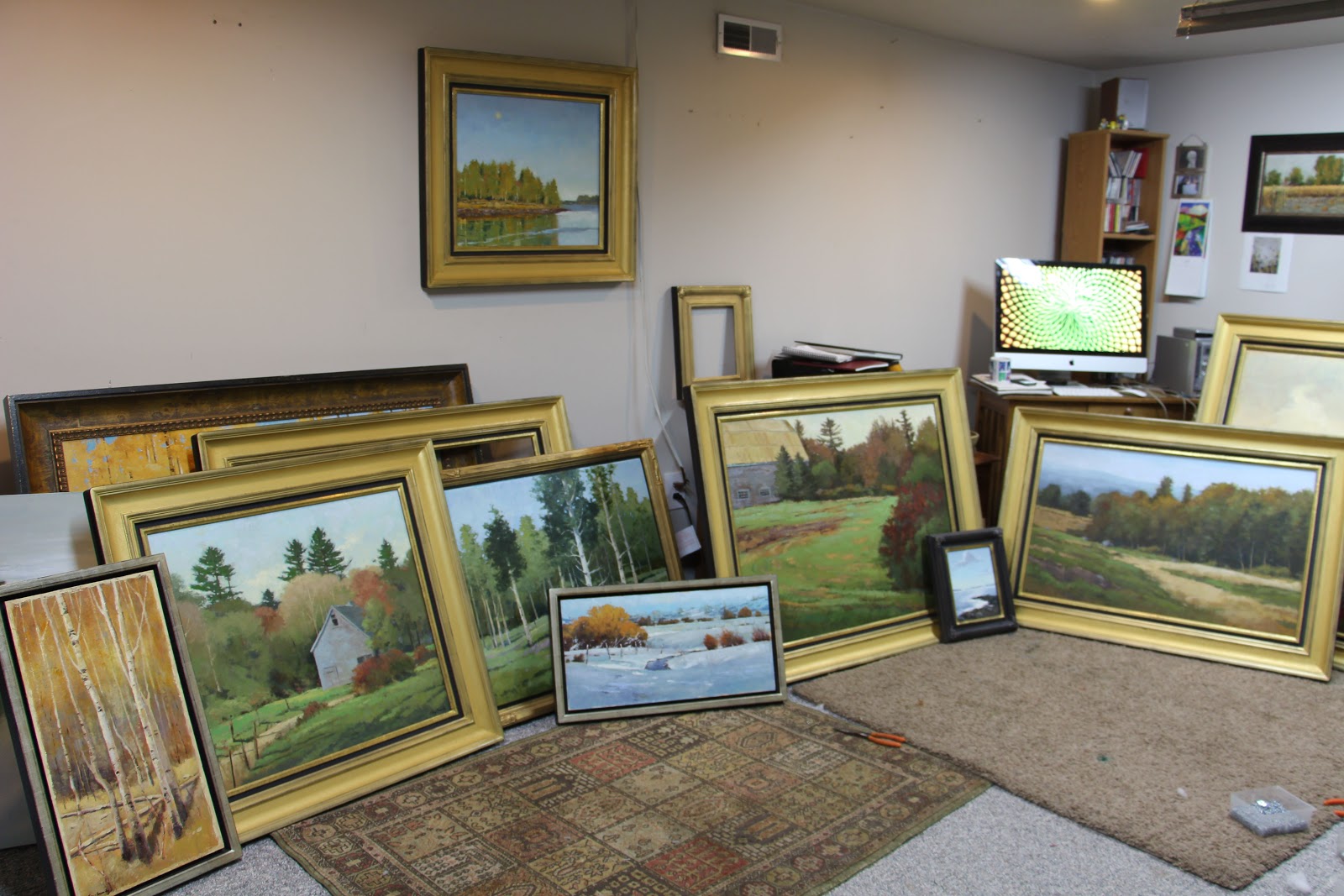
This is what my studio looked like at 9:00 am this morning and now it's empty.  It's probably hard to understand why this brings a little heartbreak I'm sure - Marco sure doesn't think so!  I just framed them last night and I am SO happy with the presentation.  Tony did such a fantastic job of designing this new frame.  I didn't get a chance to live with them for very long and I enjoyed painting this series so much.  Each piece was like I was back in Maine again, eager to learn and explore.  I've already got my next series in mind, but not quite ready to move on yet!  Maybe it's time for a little cooking :)

Thursday, January 24, 2013

That Time of Day!


You know what I'm talking about ....  for a fleeting five minutes at best the sun goes down on the landscape and creates a glow from within!  We have it on our mountain behind me every night and each and every night, I stand by my window looking for it.  I come to depend on it - it means a new day starts soon, another day to cherish and at the end of the day I look forward to dessert - like a cherry on top:)  That beautiful glow!  This painting in particular is by Rockport, Maine.  My classes have been asked to do a high key painting, using color as the contrast instead of relying on value.  I don't ask them to do anything I don't make myself do - so here it is.  Much brighter than anything I have done before, but still the values are high and close.  I think I'll start another tonight.  Something has to be part of your experience, part of your tools before it becomes natural for you!

Tuesday, January 22, 2013

Burning Bush, 28x36 oil on linen panel

Another Maine painting, two more to go!  In this piece, I wanted to express the rough texture of the building, the field and the bushes up front.  I worked with alot of palette knife and dry brush.  Again, as with the other paintings in this series, subtle color temperature shifts were used to unify value patterns and create space.  My next painting will be a little higher key and challenging to makes those shifts successful!